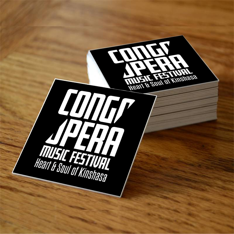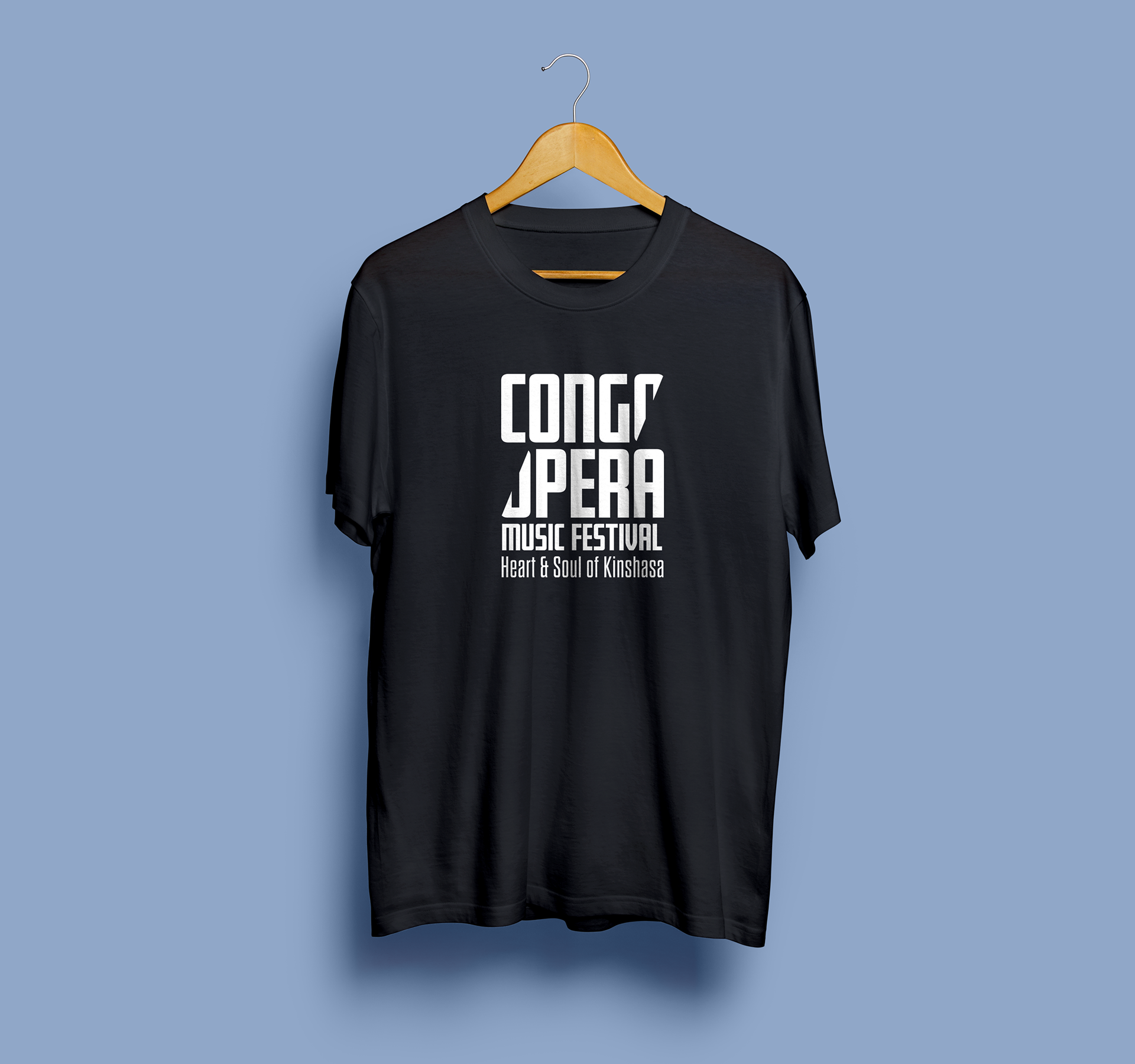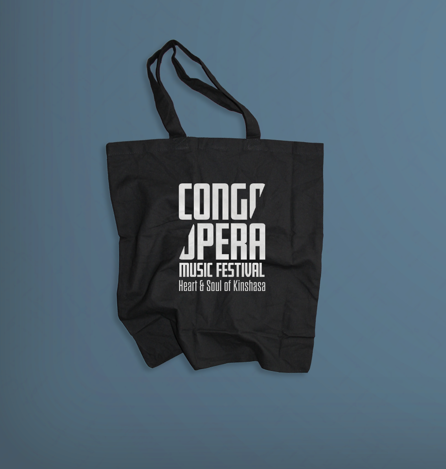
For the logo I wanted to design a logo that represents Congo clearly. In order to accomplished that I used a bold sans-serif typeface to emphasize the urban look. For the composition I knew that designing a logo that will fit within a square was the best way to go with because Congopera Music Festival is going to be a community where people will get together by the power of music & forget about the violent past in Congo. I decided to cut the "o" character into two halfs because congopera is a single word & by doing so, the logo will look clean, urban, while maintaining the simplicity, legibility & versatility since the logo will be used in the web, poster design, print ads, & promotional items such as sticker, bags, & t-shirts.

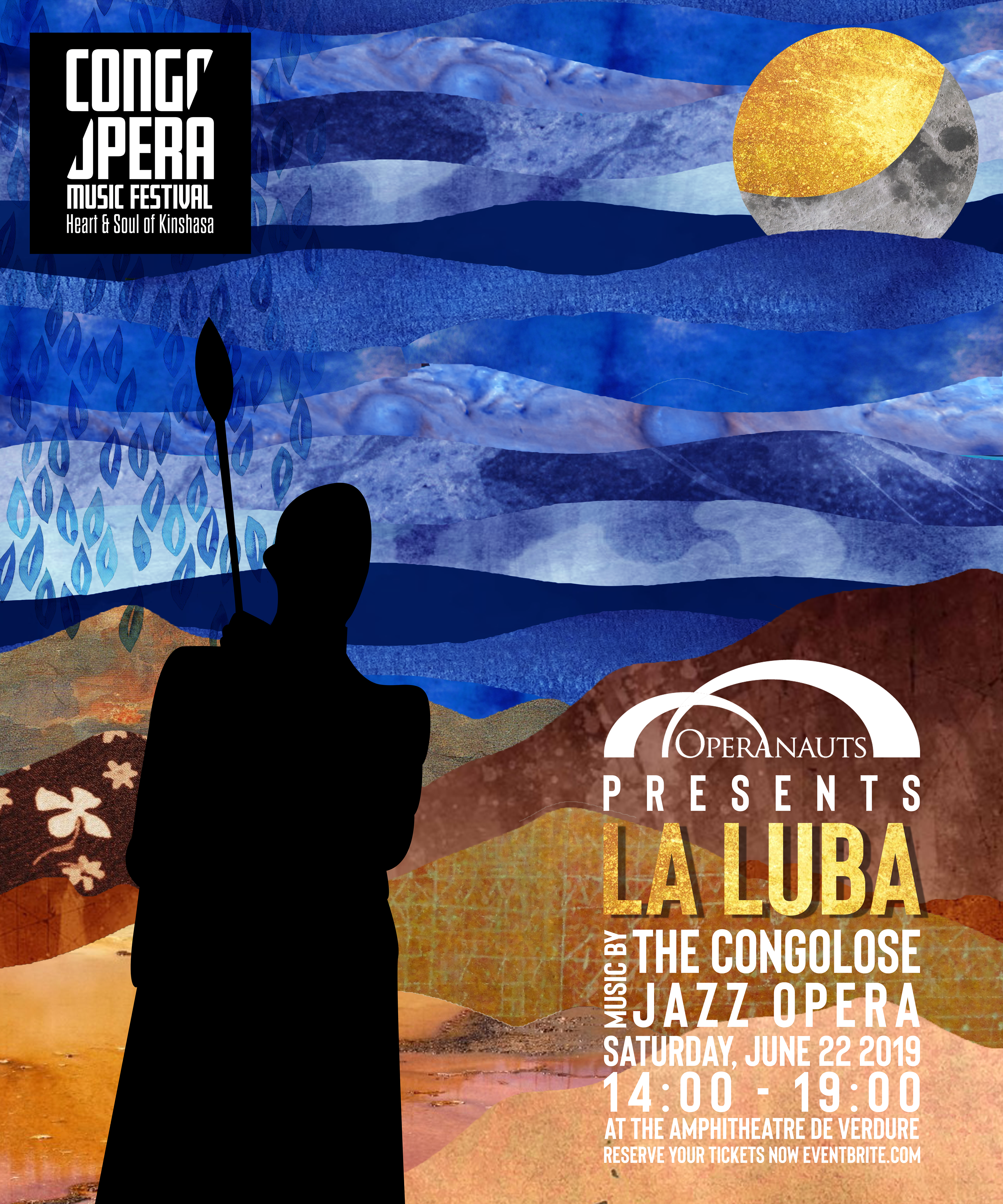
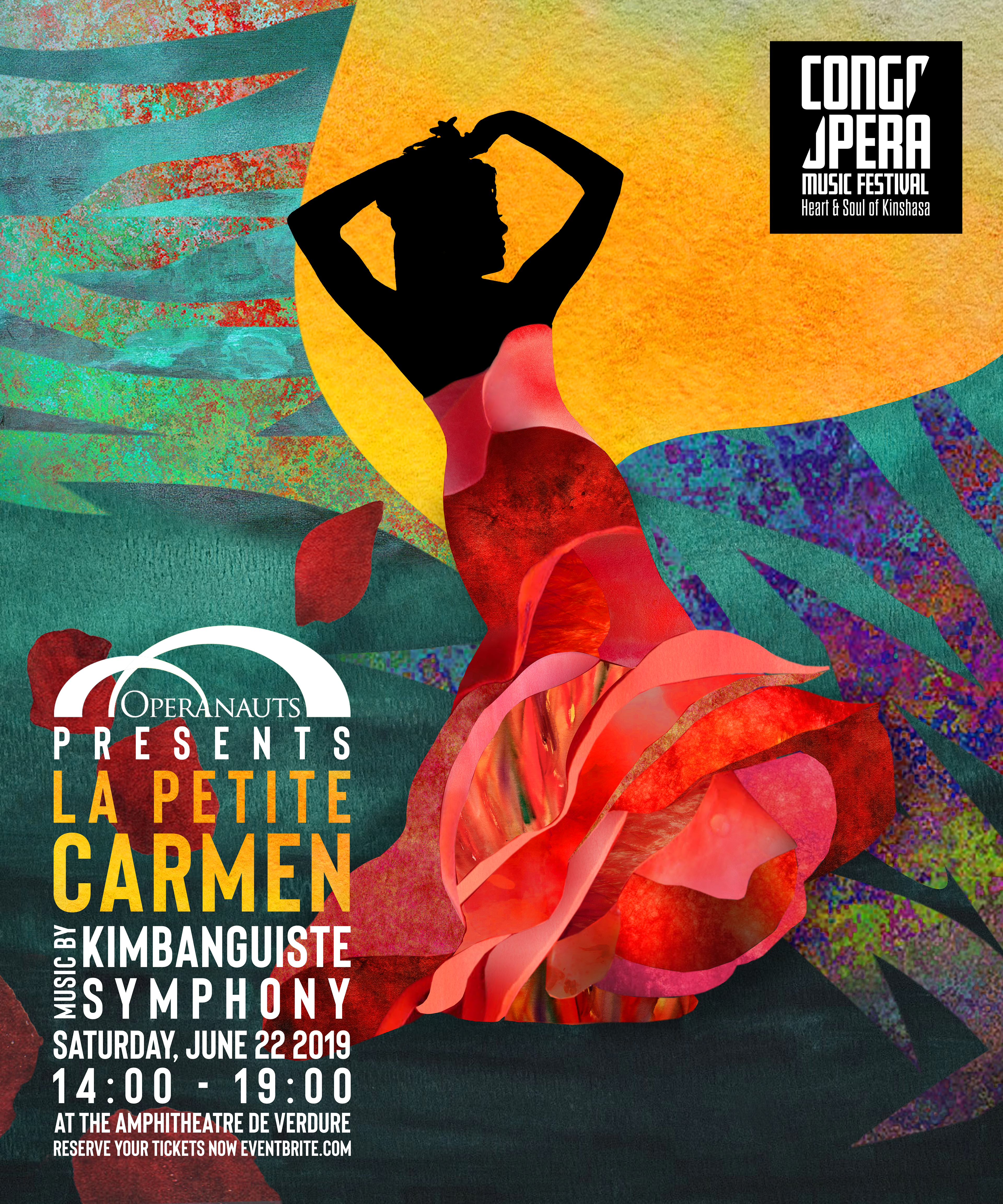
Poster Design One By: Laura Chavira
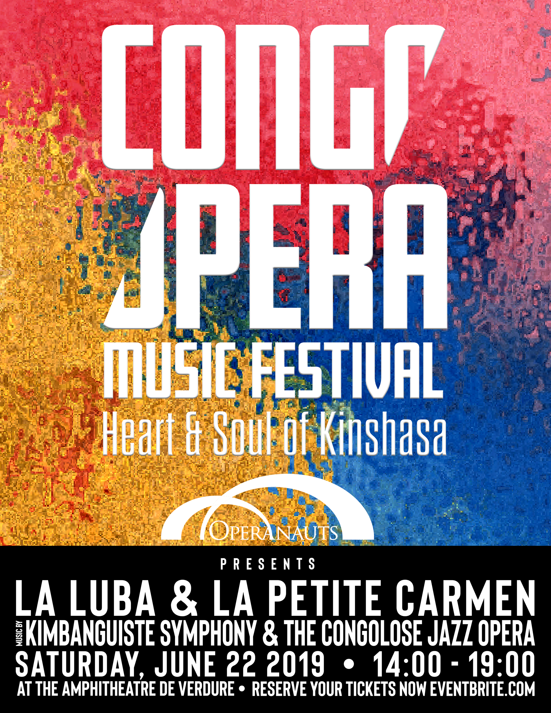
Poster Design Two By: Jeonghyun Kim
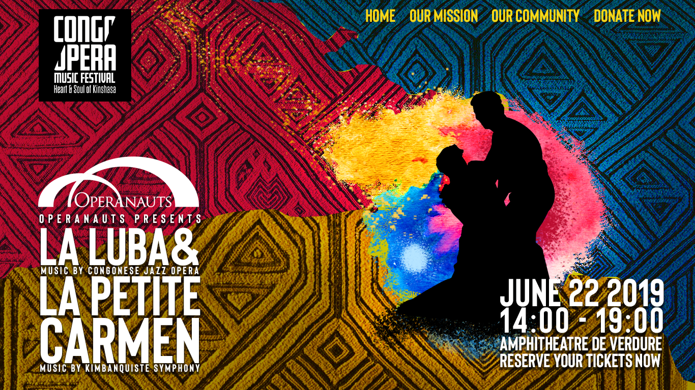
Print Ad Design By: Laura Chavira
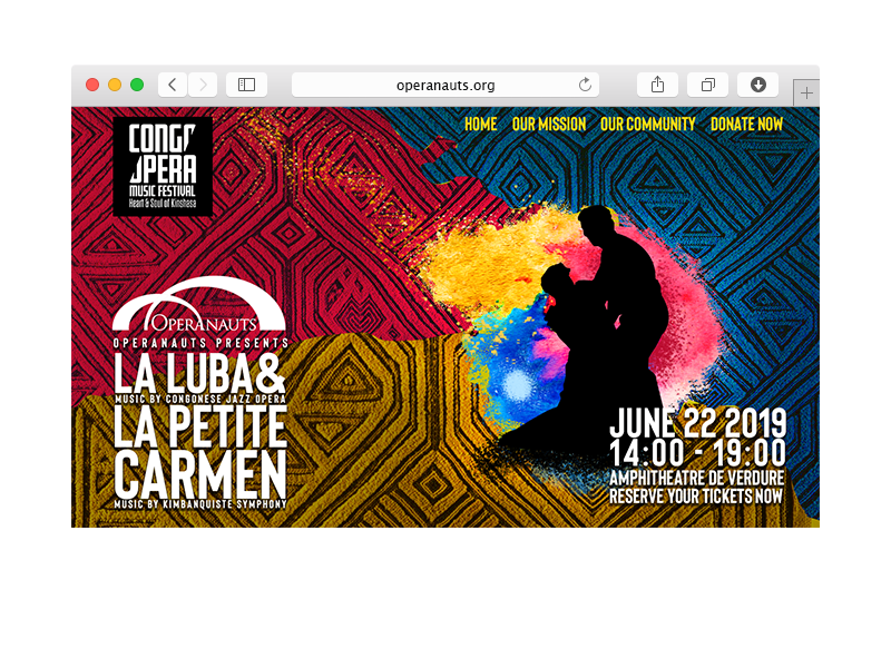

Invitation Design By Allison Gerard